You use dashboards every day, although you may not realize it. The simplest is a clock. When you wake, it tells you what time it is. At a glance, you also know how long you have to get out of the house. If you drive to work, the instrument panel in your car is another dashboard, providing key information you wouldn’t want to be without. When you look up at the dashboard in the sky, you see what nature is telling you about the weather. Dashboards surround us. In business, dashboards commonly provide a quick view of units sold and revenue. Here’s how you can use dashboards to improve the performance of your organization or business. A CFO is uniquely positioned to get the ball rolling on this.
Why use dashboards?
Dashboards provide a focal point by being a place where the entire team can focus on key business indicators. Historically, it wasn’t unusual for business reporting to be on a monthly schedule. But why wait a month or even a week to get the key information you need to do your job? With well-designed dashboards, you can capture and report information on a daily or even real-time basis.
Dashboards in business shine a light on what is important. For an airline, it may be a count of passengers in seats. For a coffee shop, it may be cups of coffee sold. For a hospital emergency room, it may be how many patients are waiting and how many patients have been treated during the shift. As a CFO, you are intimately familiar with the metrics and drivers of your business. Dashboards provide an opportunity for you to get that same information to team members throughout your company.
Where I work at DonorsChoose.org, our daily dashboard begins with how many people donated to classroom projects yesterday and what was the total value of the donations. But it doesn’t stop there. In the following paragraphs, I hope to fill you in on how dashboards have become one of our key tools.
How do they help?
High on the CFO agenda today is the use of transparency and accountability to drive performance improvement. Dashboards support a culture of transparency and accountability. Dashboards provide team members a clear view of the measurements they are responsible for. It is much easier to take corrective action to improve performance if they can see what is going on.
How do they engage the team?
In today’s world, people throughout an organization want to feel connected to the bigger picture. Although their individual efforts may not have a direct link to revenue, they certainly impact the numbers. CFOs regularly talk about this when they are providing all-hands updates. With dashboards, everyone in an organization can regularly see how their efforts drive success, reinforcing your message.
How to get started
The key to getting started is to decide on the 3-5 most important things you want to know about each day, and build a dashboard to report them.
At DonorsChoose.org, we started with the following:
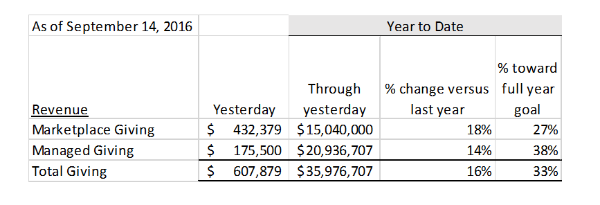
The great value of this simple report was that, at a glance, it told us
- How we did yesterday,
- How we are doing year-to-date
- How year-to-date performance compares to last year.
- d. How we are doing against goal.
Evolution, not revolution
To get to the point where we could report a handful of items, we had to tinker with our systems to ensure the data was reportable, that we had the historical data to compare it to, and that we had the goal data we needed. At first, this information was in different places. Some of it was system-generated and some of it was in paper-based business plans. Our tech team tweaked our database to enable us to add the paper-based info and to perform the simple computations required in the report.
In the early days the dashboard reported about 10 items. Each day our financial analyst would print it out and pin it above the water cooler. Originally in black in white, we soon added colors of red and green to easily signal performance that was either much better or much worse than expected. All of a sudden, everyone in our office could see how we were doing. Water cooler chatter expanded from the latest gossip to include sighs and shrieks, depending upon what the dashboard reported each day.
The bigger picture
Today you will see dashboards throughout DonorsChoose.org. Visitors to our office see a real-time dashboard on a wall mounted flat screen.
The DonorsChoose.org Daily Dashboard is now delivered via email to everyone each morning at 6 am. I’m lobbying for our tech team to build a dashboard app for the phone that reports results in real-time.
Our dashboards now come in different versions, depending on the audience. We have a version we discuss at our monthly all-hands meeting. We have a version we include in our monthly report to the board of directors. We have a version we use at board meetings. Each version uses a subset of what we report on our Daily Dashboard. Our dashboard has evolved into a tool we use to share our story with a wide range of audiences.
Over the past 10 years, our dashboard has grown from listing about 10 items to listing about 40 items. During that time we have added to and pruned the list. I still zero in on my favorite few items, and almost everyone in the organization zeros in on their specific metric each day.
Now is the time for you to sketch out the 3-5 most important things you want on your dashboard. When you get to work today, run it by a few colleagues and start publishing it. Pin it to the water cooler. You may be surprised at the conversation it triggers.
Andy Kaplan is the CFO at DonorsChoose.org.